Authentication
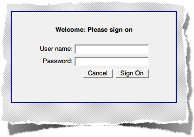 Every user has their own user name and password that must not be shared with or used by others
- Every modification to information in the student database is recorded with a user name and time stamp
- Successfully logging in to the student database creates a session that maintains security information and allows information to be retrieved from and/or stored in the database
- Sessions time out quickly with lack of activity, but can be restored by logging in again; any open forms or data are preserved when possible
Access Controls
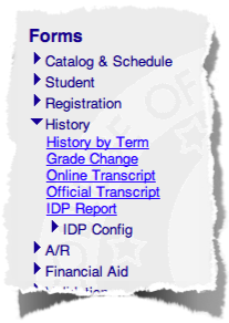 After logging in, a menu of forms is displayed, arranged by activity or functional area
- Each user has a defined set of forms they have access to, based on their role at COM-FSM and the access needed to fulfill that role
- The forms shown in the menu are based on each user's access; the menu will not contain any forms that are not accessible to them
- Forms are grouped into sub-menus which can be displayed or hidden by clicking on the menu title, e.g. "Catalog & Schedule" or "History"
- Most menus have additional sub-menus that contain reports or forms used for specific tasks or functions related to the higher-level menu; many menus contain a "Reports" sub-menu, for example, that lists reports related to the forms in the higher-level menu
- Form names are underlined, and will display a longer description if you place the pointer over them
Interface
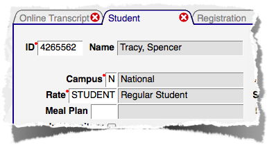 Multiple forms can be open at the same time
- Open forms are displayed in tabs at the top the window, with the form name displayed in each tab
- The
 on each tab is a "close control" that will close the form and remove the tab when clicked. If there are unsaved changes on the form, you will be prompted to verify that you want to close the form without saving them.
 - Although you can have many forms open at the same time, be careful that you don't leave a form open with a record displayed; that record may be locked and therefore unavailable to other users.
Basic Form Elements
All of the forms in the student database are built using at set of similar elements, such as tables of data or select lists. They function similarly on all forms.
Tables
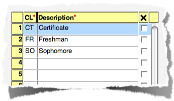 Information is displayed in rows and columns, much like a spreadsheet
- Columns names appear at the top, and rows are numbered
- A delete control (when available) is included on the right side; when checked the record to be deleted will be disabled, and any changes to the record will be undone; the record is not actually deleted until the form is submitted
- New data is always added at the bottom of the list; if a user's security allows new records to be created, an empty row will always be available
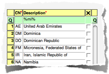 Some tables contain a query row, highlighed in green and located at the top of the table
- Clicking the button on either side of the query row (labeled "Q") performs the query
- A query is typically required when forms manage a large number of records; form requiring a query will initially display no records
- Queries can contain the SQL wildcard characters % (match any combination of characters) and _ (match a single character)
- The example shown matches records with the letters "mi" anywhere in the description; "mi%" would match descriptions starting with the letters "mi"
- Queries are not case-sensitive
Validated fields
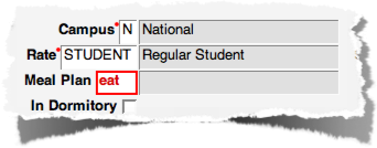
 A field that must contain a code that has been defined as valid for that data element is known as a "validated field"
- Usually displayed with a description
- Field will be highlighted in red if validation fails; correcting the entry will remove the highlight
- Codes are not case-sensitive, but will change to exactly match the defined code when validated
- Pressing Enter or Tab, or navigating to another field will cause field validation to occur
Select lists
 Contains a list of available values, often based on other key fields on the form
- Clicking on the blue triangle will display the list; clicking on a value will select it
- The up- and down-arrow keys can also be used to select a value
- A value can be typed into the field directly
- If no values are available, the triangle will be grey
 Some select lists allow entering new values in addition to those that are already known
- This is Indicated by a + adjacent to the blue triangle
- The select list displays current, known values
- New values can be added by typing them in, and are validated for the type of field
Suggestions
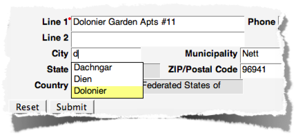 Fields display known values based on what has been typed in already
- Can be a validated field, or merely a suggestion to assist with data entry
- Most will display up to fifty suggestions
- ID field for locating people will find suggestions based on name (last, first) or ID number
Design Goals
The goal behind each of the form elements described above is to improve the overall quality of the information stored in the student database. This goal is addressed through:
 Consistency of information stored in the database, aided by validating most fields against lists of defined, understood values
- Suggested content to assist with producing accurate and complete data, even when validation isn't required
- Required fields (always marked with a red dot next to the field or column label)
Forms with invalid or missing data will not allow the data to be saved to the database!
In addition to validating entered codes and requiring certain data to be present, the database works to increase data consistency with automatically calculated and maintained information.
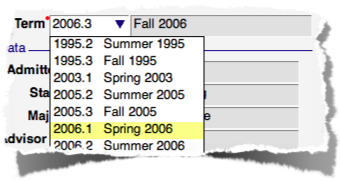
Key Values
- There are often fields at the top of forms that determine which records are displayed below
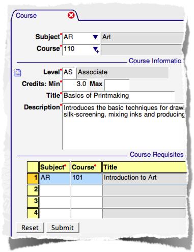
 There can be a single value, or a combination of related values
- These are known as "key values"
- Like other fields, they may be required (indicated by a red dot to the right of the field label)
- If required key values are missing, it will not be possible to navigate into the form; focus will return to the missing key value
- Commonly used keys (ID Number, Term) are remembered and automatically filled in when forms are opened
- When using a combination of keys, related values become increasingly specific
- Example: selecting the Subject "BK" limits what values are displayed in the Course select list to known courses with a subject of "BK"
Record status
 New or updated records are indicated of forms with:
 - a New or Updated record icon
- a change in row number color (to amber instead of yellow)
- Deleted records will show as updated, but with all data entry fields disabled
- The indicator for a new, updated, or deleted record will not be removed until the changes have successfully been saved to the database (by clicking Submit), or the form is reset
- Read-only records or fields are displayed with:
- a Locked record icon or
- grey row number or
- grey hash in field background
- Records may be displayed read-only when the form doesn't allow changes, your level of access doesn't allow changes, or if another user is currently modifying a displayed record
Shared Data
 Multiple people can view the same record simultaneously
- Only one person can have the ability to update a record
- The first person to retrieve a record from the database holds its lock
- Locks are released when the form displaying the record is reset or closed
- Record locks time out after two minutes (when not properly maintained, e.g. a user closes their browser window without logging out of the student database first)
Field Types
Forms are built using fields with the following types and characteristics:
- Text - Used for descriptions or other varied content; text fields have a limit on the number of characters that can be entered; some text fields will convert values to upper case
- Number - Entry must be numeric; the width and precision (how many numbers are allowed to the left and right of the decimal point, respectively) is form-specific; positive and negative numbers may be allowed
- Date - Entry must identify a valid calendar date; when entering dates, a variety of formats may be entered (e.g. 2 May, 5/2/08, May 2 08) but they will be converted to MM/DD/YYYY format; if the year is omitted, the current year will be used
- Time - Entry must be a valid time; value entered is converted to HH:MM with am/pm; when entered without an am/pm indication an attempt to guess which is correct is made based on the time of day entered
- Indicator - A checkbox used to indicate a yes/no or on/off state; the delete control is similar
- Validated - Text fields that must contain defined codes; most use a list of values available on a validation form; some may use a form-specific list (e.g. Gender is not defined on a validation form)
- Display - Read-only fields used to display information, often the description for a validated field